portfolio
Professional Diploma in UX Design
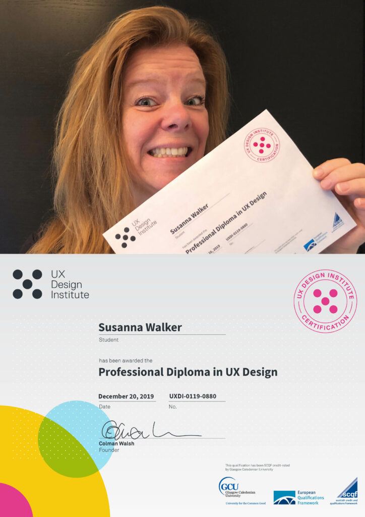
In January 2020 I finished my Professional Diploma in UX Design via Glasgow Caledonian University, run by the UX Design Institute. The assignment was to conduct research on existing flight booking websites and use my findings to design a user friendly flight booking application for both mobile and desktop. As the only designer on this project, I applied the design thinking to a four step process.
1. Research
I started off my project with some usability testing and depth interviews for both mobile and desktop. The purpose was to gain some deep qualitative insights into the usability of existing flight-booking apps.
The first step was to define my objectives and to decide exactly what I wanted to achieve from the usability tests. I created a recruitment screener, a consent form and a script for both mobile and desktop usability testing sessions. Careful attention was paid during the writing of the scripts to ensure that I didn’t ask leading questions or closed questions that would be unfruitful. After doing this preliminary work, I conducted two mobile and two desktop usability tests on SAS and Norwegian.
I also conducted a depth interview for the purpose of gaining some insights into context of use. The aim was to understand which flight-booking websites users prefer and why.
OBJECTIVES
- Identify typical user behaviour on the websites/apps.
- Discover the primary goals of the user.
- Discover which features conform to the users expectations.
- Discover which features do not conform to the expectations of the user.
- Identify elements that cause friction.
- Learn what kinds of problems will likely cause the user to leave the website.
- Discover where and when users feel empowered and frustrated during the journey.
- Identify which pieces of information are important for the user.
COMPETITOR BENCHMARKING – I wanted to learn from best-in-class competitor websites and apps. I researched four flight-booking websites, and four mobile flight-booking apps by taking screenshots from each stage of the journey and assessing what had been done well, what had been done badly and what are standard features that users expect.
ONLINE SURVEY– I created an online survey using Survey Monkey for some more quantitative-attitudinal research to gain more understanding into context of use. I used a mixture of open and closed questions as well as some multiple choice questions. The survey would take around 2-3 minutes to complete.
Please click the images to see them in full!
2. Analysis
Next, it was time to start making sense of the data. Firstly, I went through the usability test recordings, depth interviews, competitor benchmarking and survey results and took notes. I wrote them down on post-its and sorted them into categories to create an affinity diagram. Some clear categories emerged.
CUSTOMER JOURNEY MAP – I took the information from the affinity diagram and organised it into a step by step view of the journey to show how the users felt at each stage. I also noted their goals, behaviour, context and pain points at each step.
Please click the images to see them in full!
3. Designing
MOBILE FLOW CHART – Using the finding from my research, I created a mobile flowchart. Given that there is a large number of ways that a user could use a flight-booking site, I decided to narrow my scope to a linear primary use case. Flight booking journeys tend to be very linear with later steps depending on earlier steps.
DESKTOP FLOW CHARTS – It was clear to me from my usability tests that the user’s mental model was roughly the same for both desktop and mobile.
NAVIGATION FOR BOTH DESKTOP AND MOBILE – Use my research and findings to sketch out how the navigation will work at each step of the user flow.
INTERACTION DESIGN FOR BOTH DESKTOP AND MOBILE – The next step in the design process was to decide how each element on the page would work when the user interacts with it.
MEDIUM FIDELITY PROTOTYPES – After sketching each screen, I could create prototypes using Sketch and then Invision to make them interactive.
WIREFRAME – Finally documentation could be handed over to my “make believe development team”. Ideally, everything should have been considered by this point so that the development team don’t need to guess or fill in any blanks… but as this is not a “IRL project”, a few pages etc are not considered in this project.
See UX Design – 4. Finished products for end result.
Please click the images to see them in full!
4. Finished Projects

WHAT I LEARNED – During this project I learned a number of things but the most important of all was how to conduct a usability test. I found the sessions to be extremely fruitful, which made me feel assured that my designs were solving real user problems. Going forward, I feel confident about preparing for, conducting and analyzing the output from usability tests. I enjoyed gaining insights into real user behavior so that I could build more empathy towards the user and fully appreciate their needs.
I love this kind of work and the more I learn about the process, the more I want to know and learn… in a never ending story kind of way
Please click the images above to see the finished projects in Invision!


